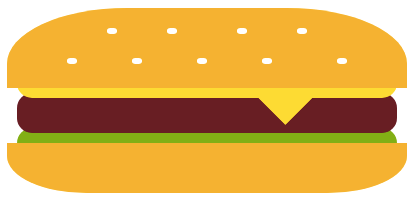
I enjoy coming up with weird programming challenges, it's a great way to have some fun while learning new things. So I recently challenged myself to draw a cheeseburger in CSS using a single empty div.
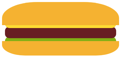
After a lot of trials and errors, I ended up with this.
That's not the best looking burger ever, but I find the result impressive considering the technical limitation.
In this article we are going to code this cheeseburger step by step.
The HTML is straightforward: a charset, a title, a link to the CSS file, and a single div.
<!DOCTYPE html>
<html>
  <head>
    <meta charset="UTF-8">
    <title>Cheeseburger</title>
    <link rel="stylesheet" href="style.css" />
  </head>
  <body>
    <div class="burger"></div>
  </body>
</html>
That's it! Now we will focus our attention on the style.css file.
The most basic CSS for our project may look like this.
.burger {
  /* Contains all the parts of the burger */
  /* Bun, cheese, meat, lettuce, and sesame seeds */
}
But that's too limited, we won't be able to fit a whole burger inside a single selector. To find more space, we should use the :before and :after pseudo-elements.
.burger {
  /* The cheese, meat, and lettuce */
}

.burger:before {
  /* The bun */
}

.burger:after {
  /* The sesame seeds */
}
That might not seem like much, but that will be enough for our purpose.
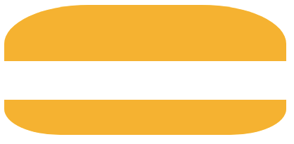
The bun is made of the top bun and the bottom bun. So we have to find a way to draw two different shapes in a single CSS selector.
.burger:before {

}
We start by drawing two rectangles using the border property.
.burger:before {
  content: "";
  display: block;

  /* Space between the buns */
  width: 400px;
  height: 55px;

  /* Top bun */
  border-top: 80px solid #f5b230;

  /* Bottom bun */
  border-bottom: 50px solid #f5b230;
}
Then we use border-radius to curve the bread nicely.
.burger:before {
  /* Same code as previously */
  content: "";
  display: block;
  width: 400px;
  height: 55px;
  border-top: 80px solid #f5b230;
  border-bottom: 50px solid #f5b230;

  /* New line */
  border-radius: 30% 30% 20% 20%;
}
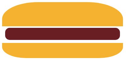
Next, we will add the main burger ingredients: cheese, meat, and lettuce. This time it's three shapes that we have to fit in a single CSS selector.
.burger {

}
For the meat we could try this.
.burger {
  /* Size */
  width: 380px;
  height: 40px;

  /* Color and shape */
  background-color: #681f24;
  border-radius: 15px;
}
This almost works. Unfortunately we can't use margin or padding to change the meat's position, since it would move the whole burger.
Let's try something different: drawing the meat with a box-shadow.
.burger {
  /* Same as previously */
  /* We just removed the background color */
  width: 380px;
  height: 40px;
  border-radius: 15px;

  /* New box-shadow */
  /* With margin-left 10px, margin-top 85px, and color #681f24 */
  box-shadow: 10px 85px #681f24;
}
That works! However we face another issue: how can we add the cheese and the lettuce in the same CSS selector? To answer that we need to realize two things:
So... we simply add more box shadows!
.burger {
  /* Same code as before */
  width: 380px;
  height: 40px;
  border-radius: 15px;

  /* Updated box shadow */
  box-shadow:
      10px 50px #fddb28, /* Cheese */
      10px 85px #681f24, /* Meat */
      10px 120px #82af15; /* Lettuce */
}
Note that the shadows' order is important, since the first one will have a higher z-index and will appear in front of the others.
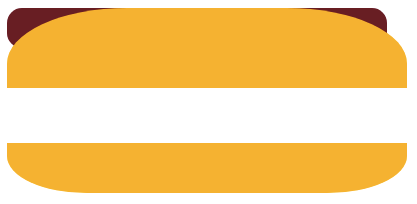
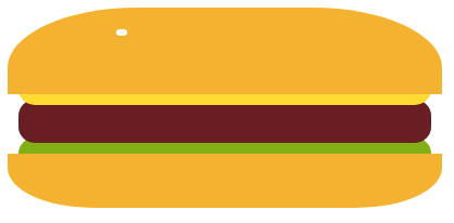
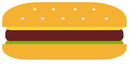
Our burger is taking shape, but it currently looks a lot like a hot dog. We should fix that by adding some sesame seeds to the top bun.
.burger:after {

}
First we draw a single sesame seed with a box-shadow.
.burger:after {
  content: "";
  display: block;

  /* Size and shape */
  width: 10px;
  height: 6px;
  border-radius: 40%;

  /* Position and color */
  box-shadow: 100px -165px #ffffff;
}
Then we duplicate it by using multiple box shadows.
.burger:after {
  /* Keep same code as before */
  content: "";
  display: block;
  width: 10px;
  height: 6px;
  border-radius: 40%;

  /* Add new box-shadow */
  box-shadow:
      /* Top row */
      100px -165px #ffffff,
      160px -165px #ffffff,
      230px -165px #ffffff,
      290px -165px #ffffff,

      /* Bottom row */
      60px -135px #ffffff,
      125px -135px #ffffff,
      190px -135px #ffffff,
      255px -135px #ffffff,
      330px -135px #ffffff;
}
It would be nice if we could show one corner of the cheese slice, to make the burger look more cheesy. But this would mean drawing a new shape (a yellow triangle) even though we already use all our CSS selectors... Can we do that?
By carefully looking at our code, we might notice that there's one thing we haven't really used so far: the content property. Let's see what happens when we add the character ▾ in it.
.burger:before {
  /* Change the content property */
  content: "▾";

  /* Color and Size of the ▾ */
  color: #fddb28;
  font-size: 120px;

  /* Then keep everything else the same */
  /* ... */
}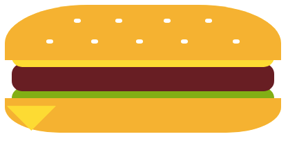
We do get the new shape displayed, but it's in the wrong position. And once again we cannot use margin or padding to solve that.
But with some CSS tricks, we can make this work.
.burger:before {
  /* Add 8 spaces before the triangle */
  content: "        ▾";

  /* Actually display the spaces in the "content" */
  white-space: pre;

  /* Vertically position the ▾ */
  line-height: 25px;

  /* Then keep everything the same */
  /* ... */
}
And we finished our cheeseburger!
When emailing a friend about my challenge, she replied with this clever code snippet.
.burger:before {
  content: "🍔";
  font-size: 100px;
}
That's a lot less CSS for a better looking result.
I'm impressed with what I managed to achieve with a single div and some CSS. Of course using SVG would have made more sense, but where's the fun in that?
